Visualizing data with Amazon QuickSight
Vizualizing data with Amazon QuickSight
In this section of the lab, we will create a visualization using Amazon QuickSight
Ensure that you are signed into the AWS Console as the “lf-admin” user
Navigate to the Amazon QuickSight service in the AWS management console, where you will be prompted to Sign up for QuickSight. Click the button to begin the sign-up process.
On the Create your QuickSight account page select the Standard Plan and then click Continue.
For region select US East (N. Virginia) and then enter a unique QuickSight account name (such as
datalake-lab-<yourinitials>) and provide a Notification email addressEnsure that the tickboxes are checked for Enable autodiscovery of data and users in your Amazon Redshift, Amazon RDS, and AWS IAM services, and for Amazon Athena.
Also click the checkbox for Amazon S3, and when prompted mark the tickbox for Select All to enable QuickSight to work with data in all S3 buckets. Then click on the blue Finish button, and on the next screen click on the blue Finish button.
When you get the confirmation screen that you have completed sign-up, click on Go to Amazon QuickSight.
On the “What’s New in Amazon QuickSight” pop-up, scroll to the bottom and click Close
By default, the QuickSight console shows a few default visualizations. In the top left click on New Analysis and then New data set. Select Athena as the source
For Data source name enter
Sales-Channelsand then click on Validate connection so that QuickSight can confirm it has the required permissions to access Athena. If the validation step fails, click on your user name at the top right of the screen and review your security and permissions settings to ensure that Athena was added.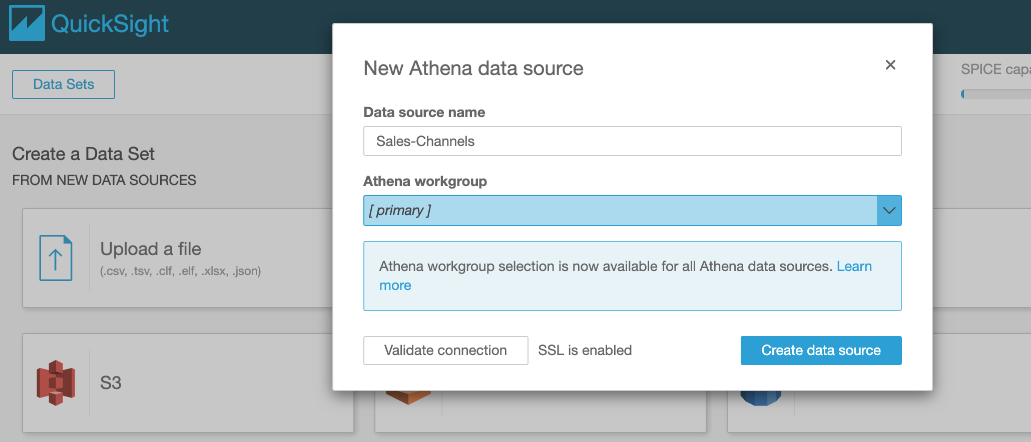
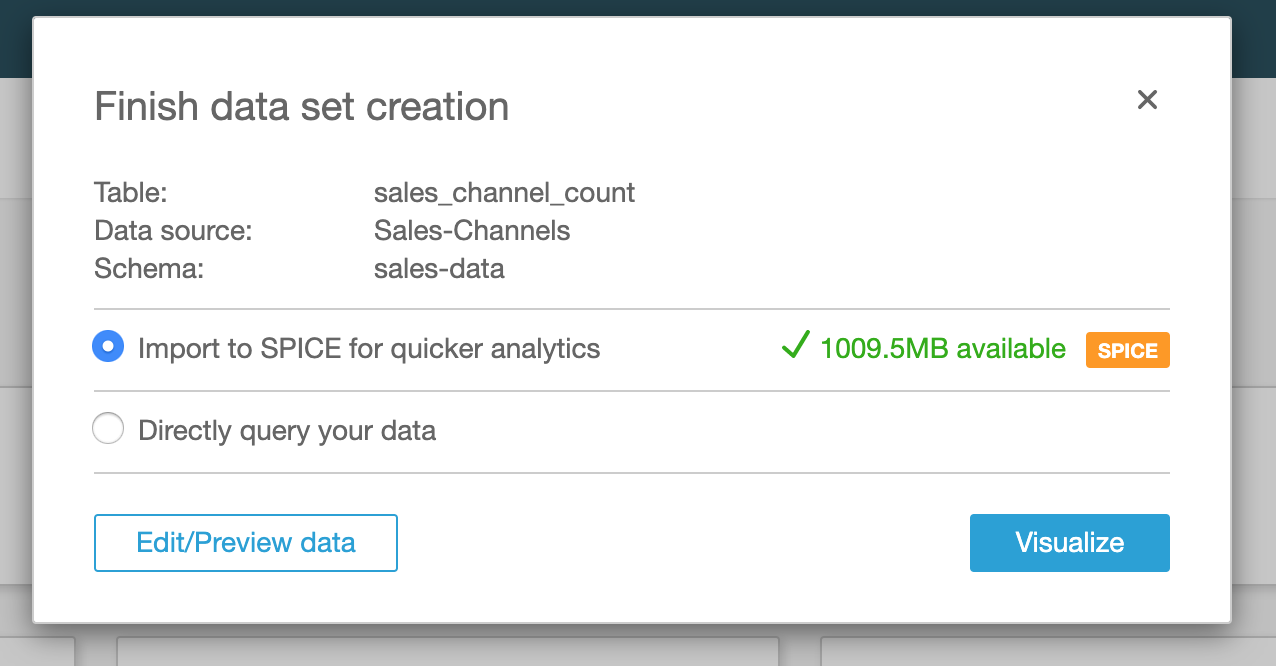
Once validated, click on Create data source and then select the Athena sales-data database and the sales_channel_count table and click Select
We have the option to directly query the data via Athena every time a query runs, OR to import the data to SPICE (QuickSight’s Super-fast, Parallel, In-memory Calculation Engine). Let’s select SPICE for our LAB and then click Visualize
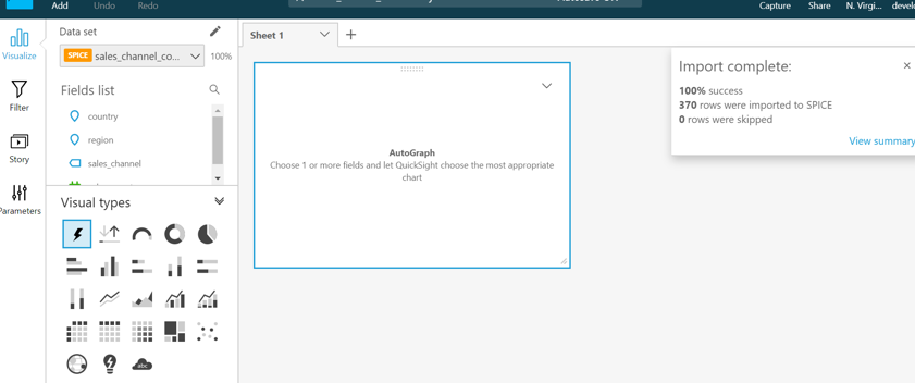
Next we get the Visualization view where we can build a new report. The right panel shows the Import to SPICE completed successfully. Click on the X on the Import complete box to close the message.
Note that if the import failed you should check your QuickSight profile security permissions and ensure that the bucket created for this QuickSight lab is added to security and permissions.
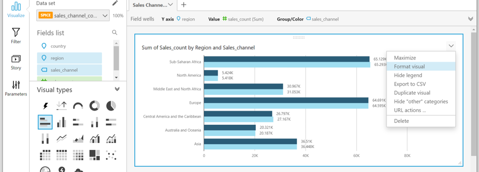
On the left-hand side of the screen, under Visual types, select the Horizontal Bar Chart icon
Along the top of the visual, if not already expanded, expand the Field wells toolbar by clicking on the double-down arrow on the far right.
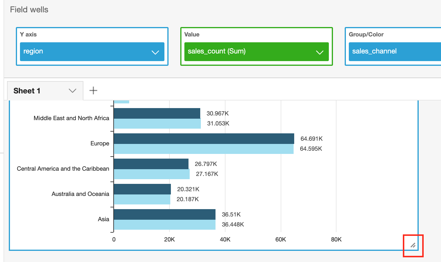
From the Fields list on the left-hand side, drag region field to the Y axis across the top of the visualization. Then drag sales_count field to Value and sales_channel to Group / Color. This will give us a report that shows Sales Channel count per region
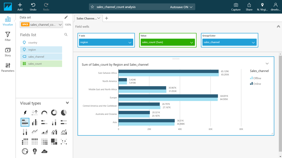
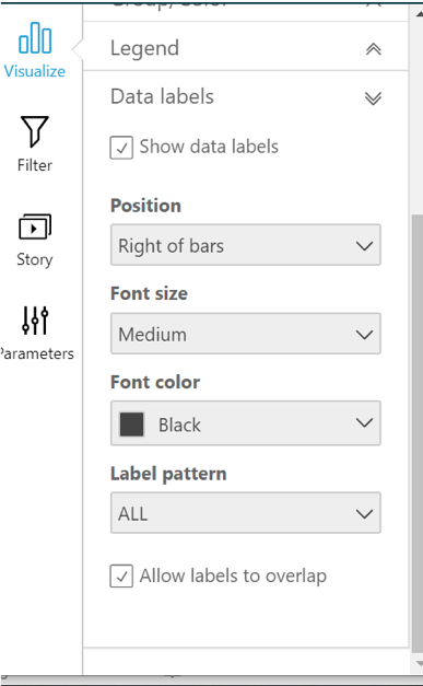
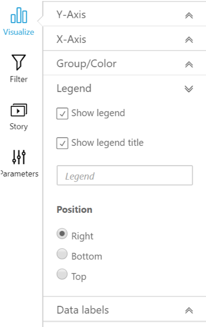
From the visual’s top right drop down (to the right of Sum of Sales_count by Region and Sales_channel) select Format visual, through which we can apply Legend and Data Labels as shown below
Drag the diagonal bars in the bottom right of the visual window to make the visual larger
If time allows, click on the + ADD button at the top left of the screen and click Add Visual. Pick a different visual type and experiment with creating different types of visuals.