Data Visualization using QuickSight
Configuring Amazon QuickSight
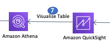
In this section we will configure Amazon QuickSight - a fully managed service for authoring and publishing interactive dashboards to visualize data. For this lab we will use QuickSight to visualize customer sample data in our data lake using Amazon Athena.
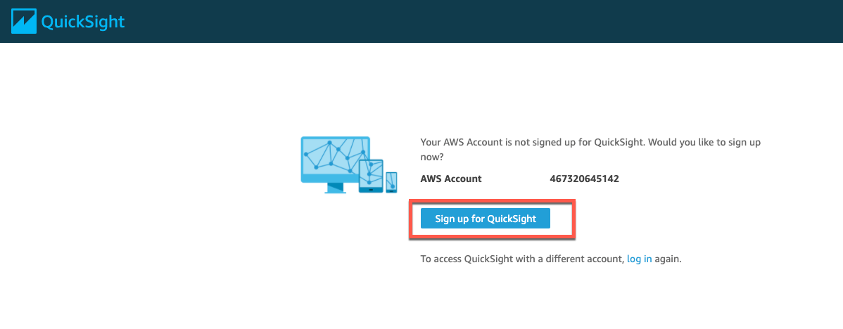
On opening the Amazon QuickSight console, it will ask you to sign up for Quicksight. Click on the Sign up for QuickSight button.
Select Enterprise Edition and click Continue
Here you can also see a side-by-side feature comparision between Standard and Enterprise edition.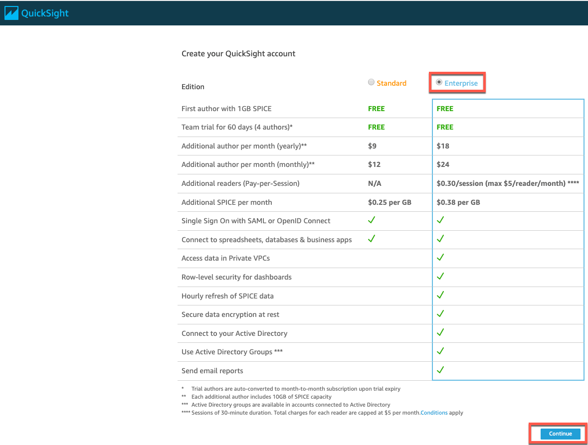
On the next screen:
- Select US-East(N. Virginia) as Region
- Provide a name of your choice for Account name, but ensure that the name is globally unique (e.g. serverlessdatalake-
<first-lastname>-date). Provide a valid email address for receiving Notifications.
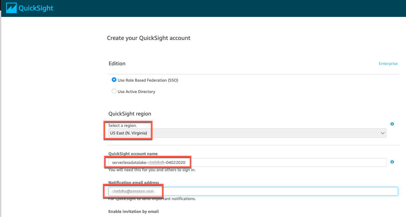
Scroll down and select the Amazon S3 checkbox as Quicksight will be reading underlying data from S3 buckets
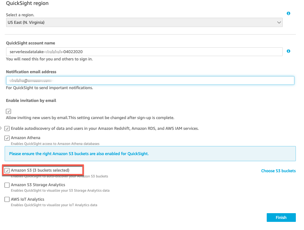
On selecting S3 checkbox, it will open another window for S3 bucket selection. Select Select all and select Finish to come back to the original window.
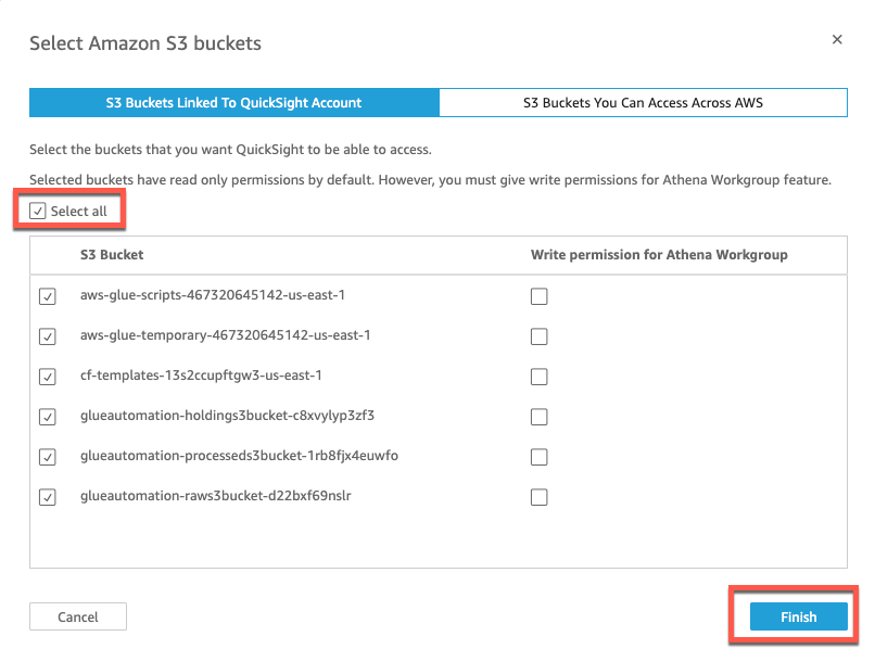
Select Finish on the main screen to complete Quicksight configuration.
Data Preparation
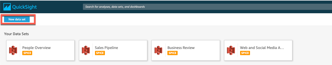
Once your account is successfully registered with Quicksight we can register the dataset we want to query using Manage data in the top right corner.
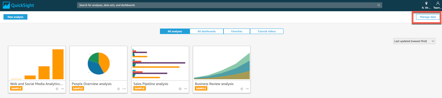
Click Manage data and then New data set on top left corner
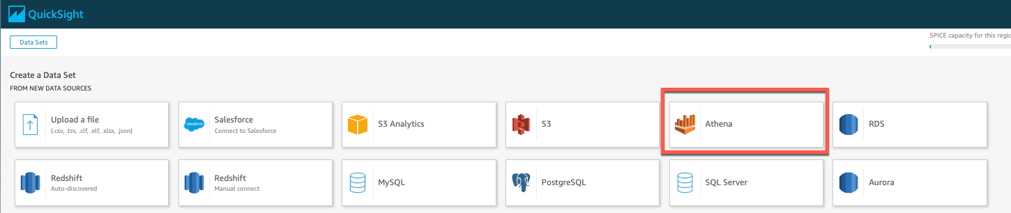
Select Athena as we want to visualize data from the Parquet table.
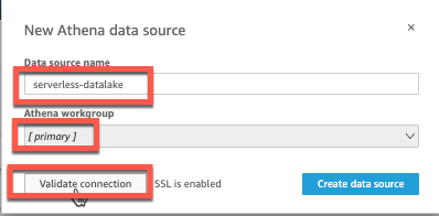
For Data Source name provide a name of your choice and keep Athena workgroup as Primary. Click Validate connection.
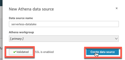
Once the details are confirmed and status is shown as Validated, click Create data source
In the next screen it will prompt you to choose your table. Select the Glue catalog database you provided earlier (e.g. glueautomation)
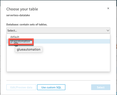
It will list 2 tables underneath the database - one for CSV format and another for Parquet format. In this workshop we will be visualizing data from the Parquet format table (
<stackname>-processeds3bucket in it’s name) so mark the selector for this table and then click Select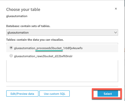
Quicksight is now ready to import the data for analysis. Click Visualize
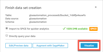
- Quicksight will start importing the data into SPICE *(Super-fast, Parallel, In-memory Calculation Engine)* and once the import is complete it will show the status on the top-right corner.
Once data is loaded into Quicksight memory we are ready to create nice charts 😃
Data Visualization
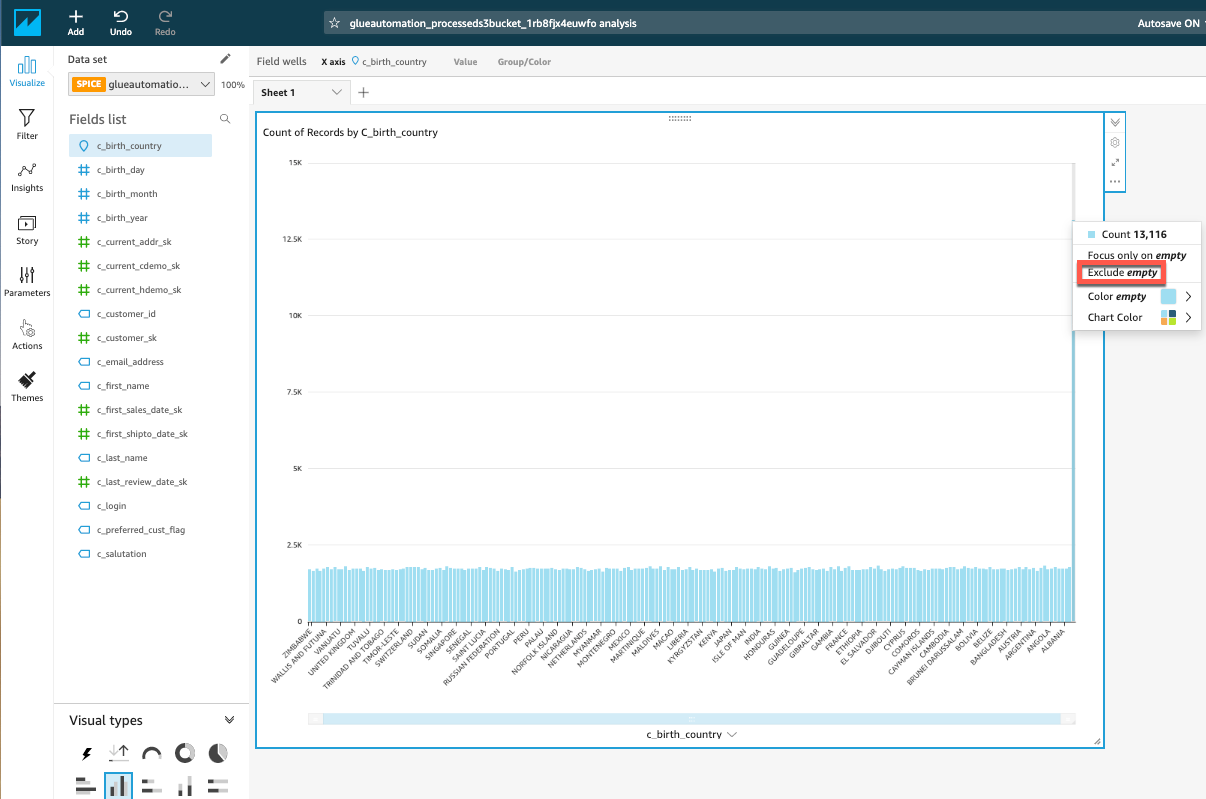
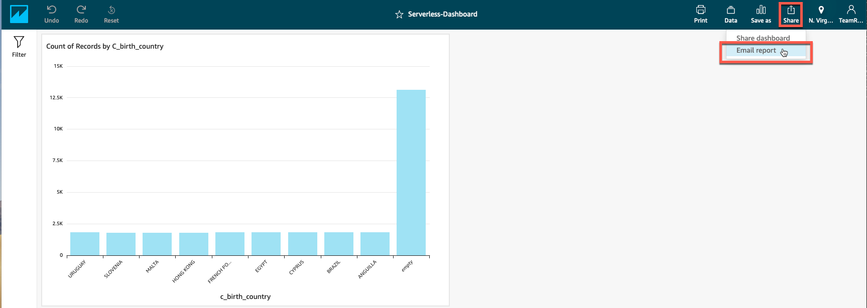
Let’s first create a visual graph to see our customers distribution by their birth country.
Select c_birth_country under Fields list and select Vertical bar chart from Visual types. Quicksight will automatically populate the graph as shown: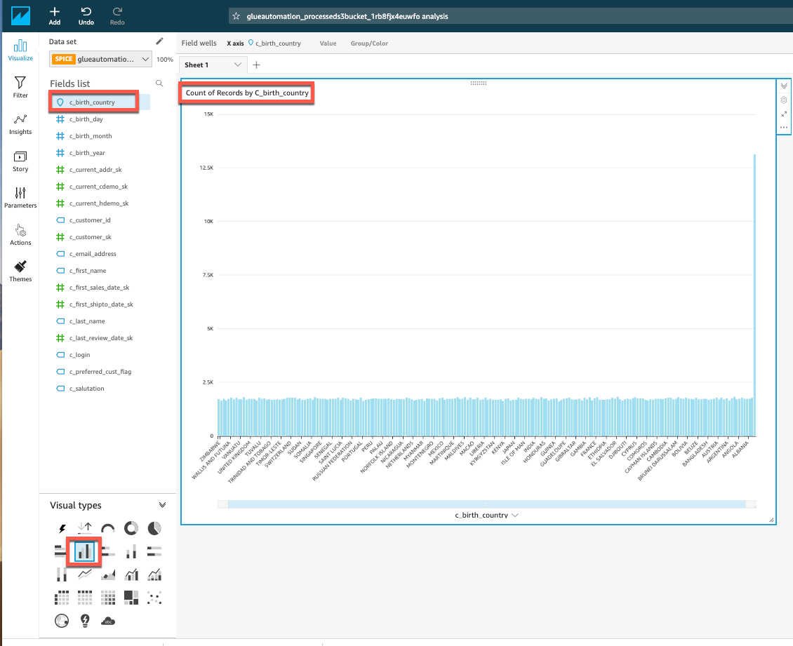
What do you think about the graph??
Hover your mouse over the right most top vertical data line on the graph and you will see empty values. Let’s exclude these empty values and visualize it again!!To exclude these empty values, right-click on top of the top most vertical data line on the graph and select Exclude empty as shown:
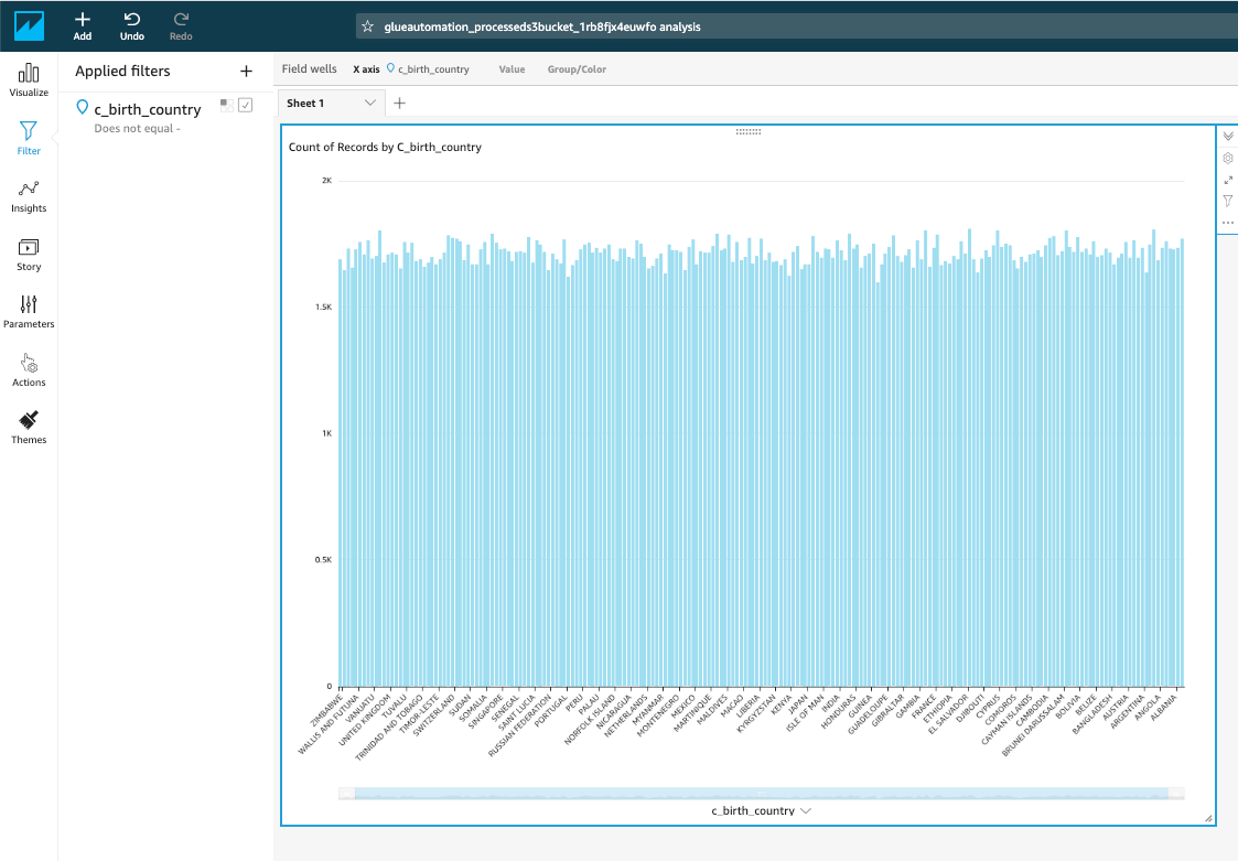
- Quicksight will automatically re-draw the graph after excluding these values and dislay the updated graph:
- Quicksight will automatically re-draw the graph after excluding these values and dislay the updated graph:
How about focusing on the top 10 countries??
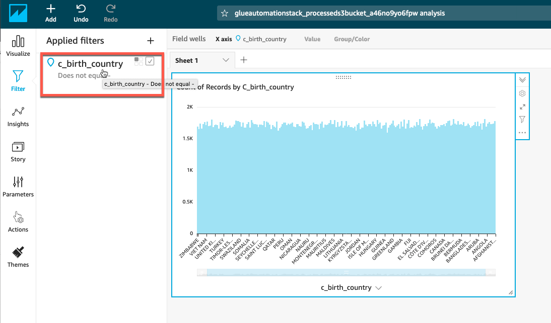
Under Applied filters, select existing filter c_birth_country as shown:
Under Edit filter option, select Filter type - Top and bottom filter and then Show Top 10 and under Select_field highlight c_birth_country
Click Apply to apply the filter and see how the graphs get populated dynamically.
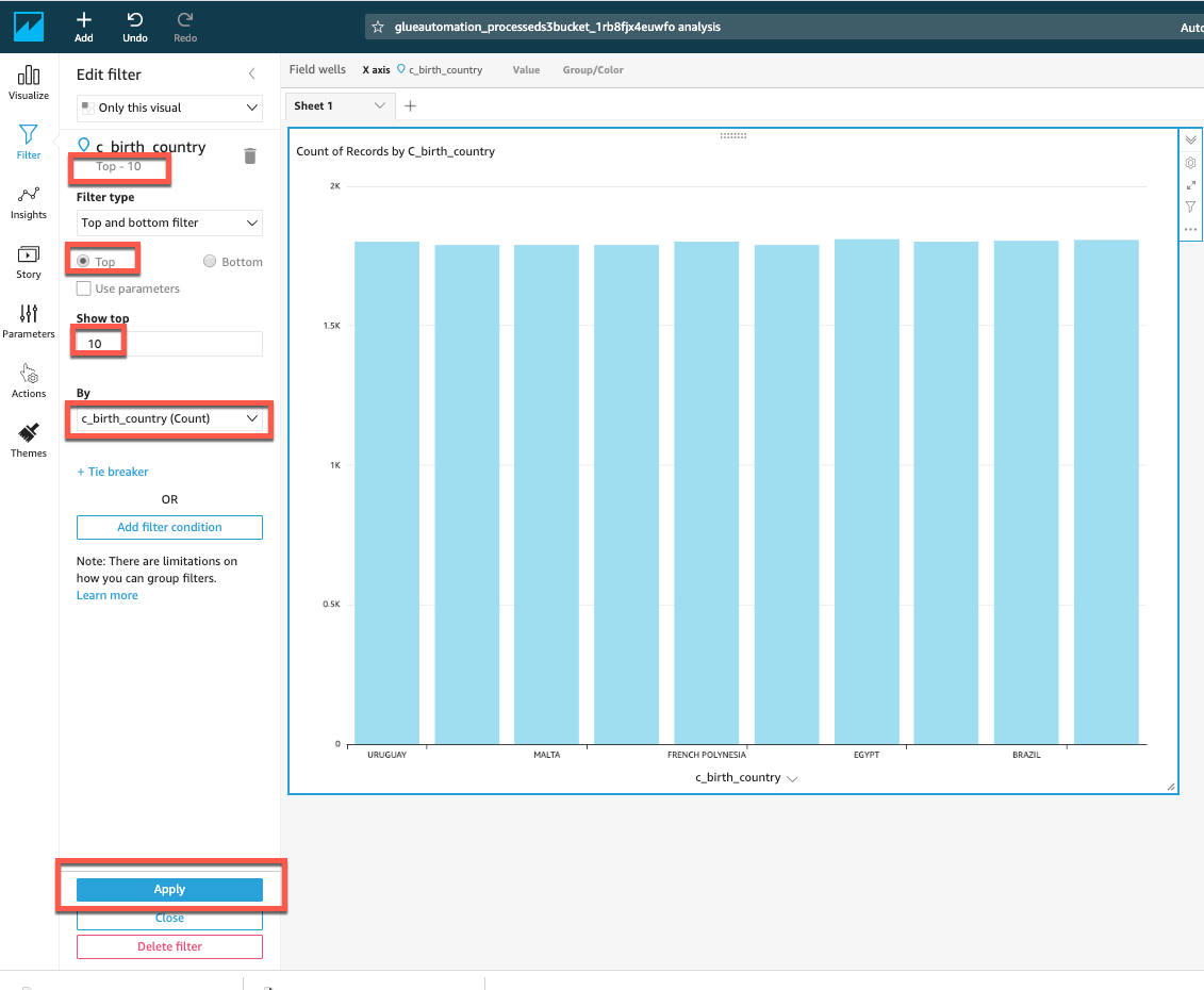
Can you tell which are the top 10 countries in the list???
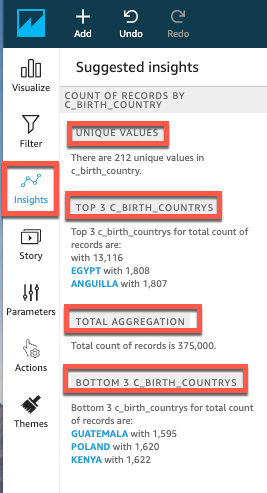
In order to get inference about the data from Quicksight, select Insights under the navigation pane and QuickSight will provide useful information like - How many unique values are there in the graphed column, which are top 3 & bottom 3 values and total number of records.
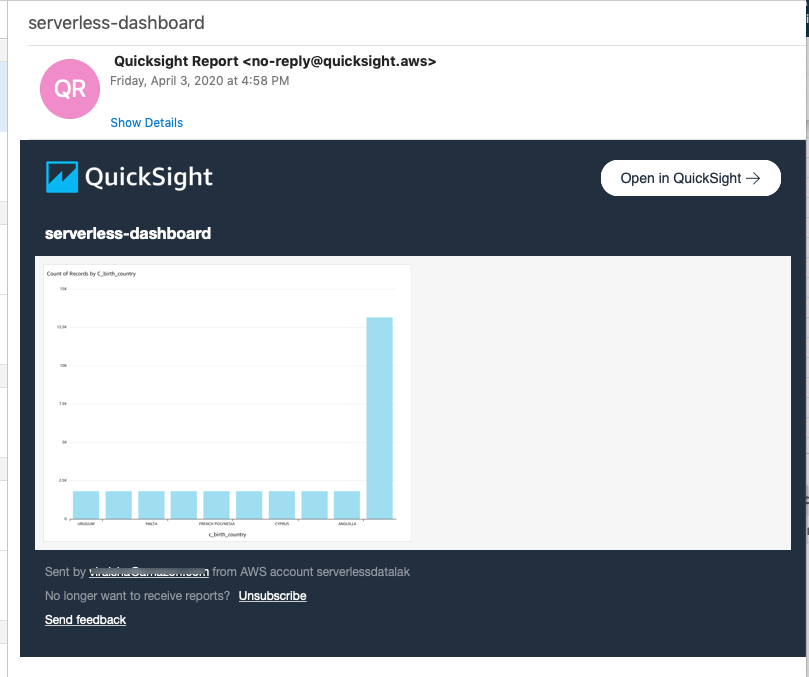
You can save the report on Quicksight Dashboards by clicking Share and Publish Dashboard in the top-right corner.
Provide a dashboard name of your choice (e.g. serverless-dashboard)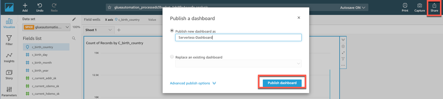
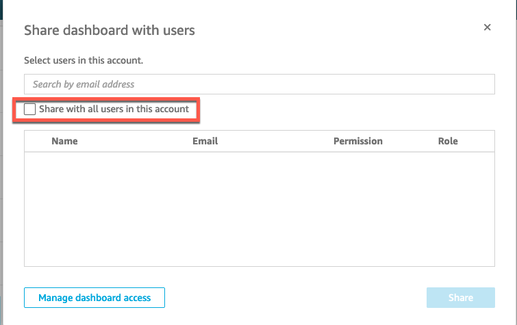
- On selecting Publish Dashboard it will pop up an another window asking you to select users to share the dashboard with.
Select Share with all users in this account as shown:
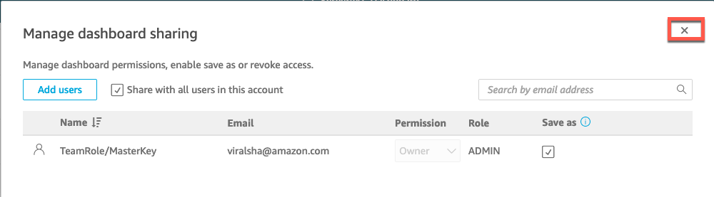
Next, on the Manage dashboard sharing window, just close the window as we are not modifying any users permissions for this workshop.
To Email the published dashboard, select Share and underneath the dropdown select Email report
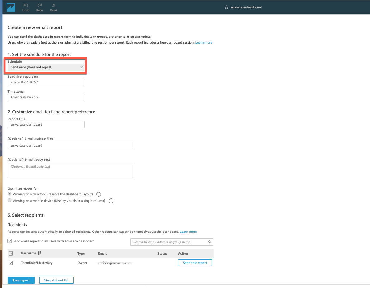
On Create a new email report page fill in following details:
- Schedule - Send once (Does not repeat) for this workshop
- Recipients - Ensure that checkbox next to your email address is selected
Save Report
After a few minutes, you should receive an email from Quicksight on the designated email address.